
Impulsa 2026 event branding
A business summit built to launch women entrepreneurs onto the global stage. A case study in event, exhibit branding and institutional identity design · Puebla, México · 2026

Industry: Event & Institutional Branding
Services:
Brand Strategy
Identity Manual
Messaging
Sales deck
Environmental Design
Social Media Manual
Email Campaign
Website
Print Collateral
Screen Motion Graphics
Challenge:
When AMMJE Angelópolis began planning the installation of its new board of directors, the organization saw an opportunity to make it something bigger: IMPULSA, a business summit built around one idea, from local to global, helping women entrepreneurs take their companies from domestic markets to international ones.
It's the same journey I guide my own clients through every day.
The keynote was sponsored by the Secretaría de Economía y Turismo de Puebla through its Conéctate Emprendedor program, and the event carried the presence of municipal and state officials and federal deputies.
It needed a visual identity worthy of that level of institutional weight, and one that could still speak directly to the founders in the room preparing to export and scale. The summit took place at the TEC DE MONTERREY Conference and exhibit hall

Strategy
Defined the summit's core narrative: growth isn't a straight line, it's built decision by decision, from local roots to a global stage.
Ideation & Storytelling
Developed the "path of decisions" concept, translated into a single visual system.
Design
Brand identity, brand manual, messaging, environmental design, print collateral, social media manual, email campaign, website, motion graphics.
Implementation
Directed execution across every touchpoint on-site.
Vendor Leadership
Led and coordinated the vendors producing and installing every physical material for the event.
.jpeg)
Growth isn't a single leap
No business grows in a straight line. It's built decision by decision, each one a step that only makes sense once the next one follows.
That idea became the physical experience of IMPULSA. On the summit floor, a repeating pattern traced a literal path, decision after decision, connecting across the venue for attendees to walk through. On screen, that same path unfolded in motion, piece by piece, before finally converging.
The logo
The logo tells that story in two versions.
The primary logo frames "IMPULSA 2026" inside a fused gradient circle, with the zero rendered as the four separate pieces, not yet merged.
The secondary logo compresses that arc into one: the four pieces disappear, and the zero itself becomes the fused circle.
Two logos, one arc: pieces becoming whole.
Both are minimalistic and disciplined in form, built to carry institutional weight. The vibrant gradient is what makes them feel alive, the entrepreneurial energy against a grounded, trustworthy deep blue.
The colors
The deep blue grounds the mark in trust and institutional credibility. The vibrant palette inside signals the variety of decisions, every area of the business, and the founder's own creativity in shaping her path.

A world in three dimensions

The challenge: Identity manual
My process always starts from the same place: seeing a brand as a whole world, not just a logo. That's what makes a multidimensional experience possible.
Building this identity meant anticipating everything that would carry it: digital assets, booths, banners, video guidelines, even the badges attendees wore. Most of that work happened before a single vendor got involved, so a floor decal, a screen animation, or a printed sign could all be produced without second-guessing.
That kind of groundwork is invisible when it's done right.
IMPULSA was the chance to prove that philosophy at full scale: a brand you didn't just see, but walked through.
One idea, four voices
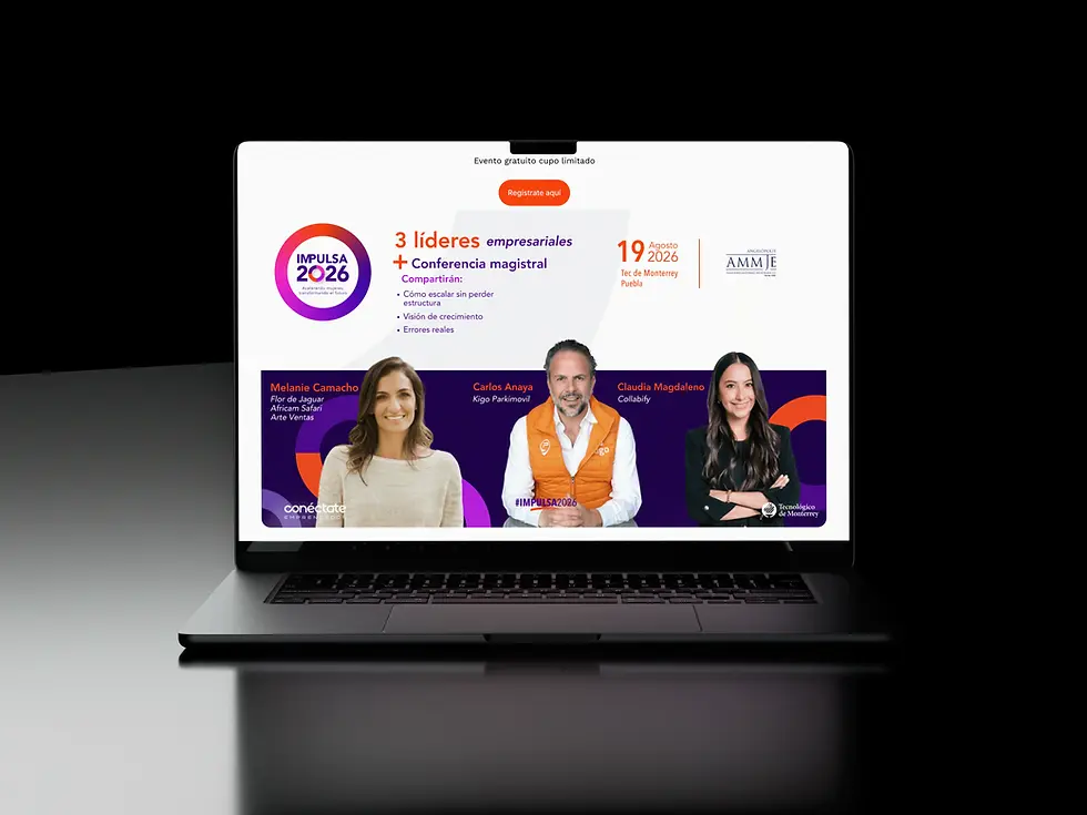
Messaging: Social & Mailings
The messaging strategy carried as much weight as the visual system. Every social post and email was built around inspired, quotable phrases, each one distilling the core idea of a specific speaker.
The real work was in the connective tissue: making sure all four speakers, each with a different message, ultimately tied back to one idea, scaling a company from local to global.

The Pitch Behind the Podium
Before the summit had a stage, sponsors, or a single confirmed speaker, it needed a deck that could sell the vision, and secure the government's backing along the way.

escalar
hoy
.jpg)

Emails that filled the room
A coordinated push of 15+ email touchpoints paired with social media, each one carrying a piece of the same story, from first announcement to final countdown.


On the ground
From totems to the registration bar, the same system carried through every physical surface attendees encountered. Floor decals traced the path itself, ups and downs included, a reminder that a business is a road, not a straight line, and the only real failure is stopping.


